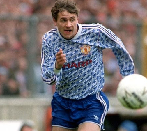
The most horrid club football shirts!
Every year shirts come out that you would rather not walk around in. Some clubs really do go over the top when it comes to ugly shirts. Some of these ugly football shirts later became collector’s items and therefore made people a lot of money. Others just remain so awful that it is wonderful to reminisce upon. You will find a mix of both in this list. We have only included club shirts in this list. There are no international shirts or keepers’ jerseys.
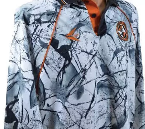
Dundee United 1993
It is 1993, grunge is in its heyday and Kurt Cobain has one more year to live. Let’s remember that someone did come up with this shirt on a drizzly morning in Scotland. It’s as bleak as the football in Dundee itself. Thumbs up to Jackson Pollock. Hip, trending and with a genuine feeling for the zeitgeist. Fortunately, they did manage to secure a comfortable sixth-place finish in the Scottish league.
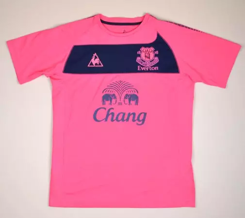
Everton 2010
Have you ever been to a full moon party in Koh Paghnan? Well, there is a decent chance that you will have come across Everton’s away shirt every three metres. Buy a bucket of booze and go crazy with your neon lights. This very cheap looking shirt has a nice blue bar with a cool wave at the end. It’s no fun playing away from home this season. Sometimes football shirts are so wretched that they become a cult hit. That just doesn’t do this shirt justice.
Fiorentina 1992
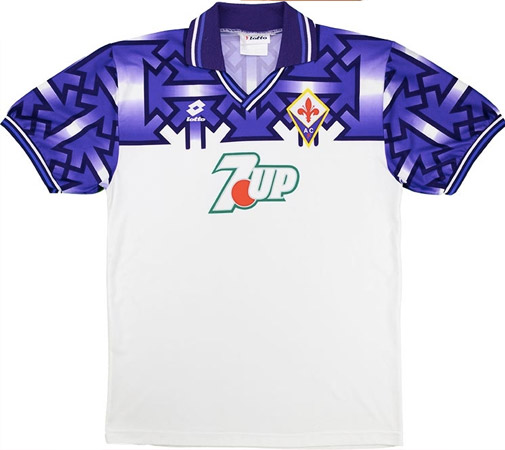
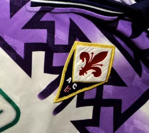
Not only is this shirt ugly but it also caused quite a lot of controversy at the time. This is because of the swastikas that are (accidentally?) on the chest. This has ironically become a sought-after collector’s item. The shirt was banned almost immediately from the moment it was unveiled. This shirt was only played in the once. A friendly against Aston Villa. There are still a handful of them doing the rounds.
Arsenal 1991
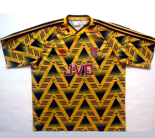
Historically speaking, Arsenal have a good season if they have a yellow away shirt. As it is often proven for those in this list, that was not the case this season. This gem from 1991 was the “come look at me” at the time. Hip arrow triangles that can both pass for 90s computer graphics and would not look out of place if you ever had an Aztec themed party. The three stripes in between form part of the Adidas logo. Ironically, this ended up being one of the last shirts that Adidas would make for Arsenal. Nike soon took over the reins.
Do you want to go to a football match yourself?
Would you enjoy wearing your hideous football shirt inside the stadium? Then have a look at the football excursions below!
With FootballBreak you will have
- Seats which are always guaranteed to be next to one another
- Financial security with the SGR (travel money guarantee foundation)
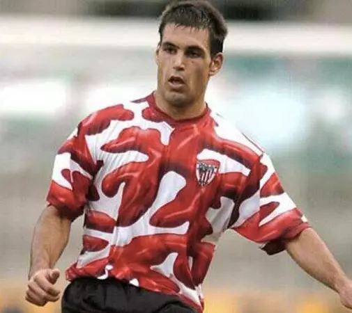
Athletic Bilbao 2004
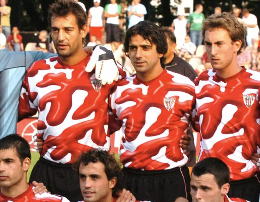
Have you been shot with ketchup? Is it an ode to the Dexter series? Or is it Salvador Dali’s hallucinatory wet dream? Well, this awful shirt completely misses the mark. There have rarely been any uglier shirts than this one released by a club. The false 3D effect really rounds this shirt off.
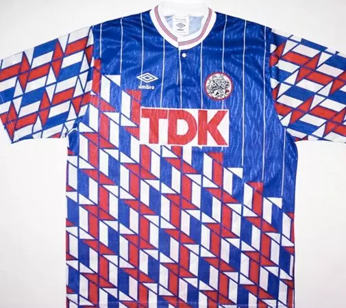
Ajax 1989
A shirt from Dutch dredges. TDK was the main sponsor of Ajax in 1989 when this shirt was released. A really chaotic shirt where the opponent is immediately taken aback. Should it be a comparison with Mondrian? This shirt is very popular among Ajax supporters.
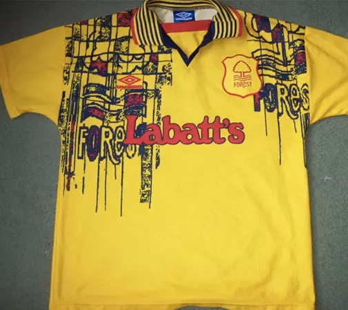
Nottingham Forest 1995
Give a urine yellow shirt and black marker pen to a toddler and there you have the Nottingham Forest away shirt. Now fill in a space with red and then and you’re all done. The bad thing is that they also strutted around in this for two seasons. This shirt remains incredibly ugly, even from a retro perspective.
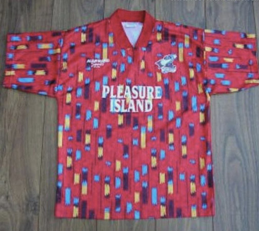
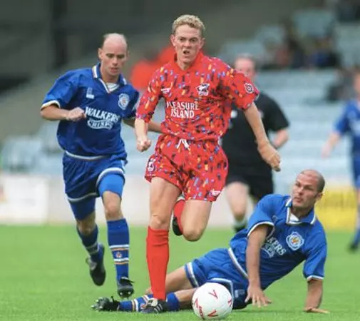
Scunthorpe united 1994
This wonderfully hideous shirt is just like the design of practically every tram or train seat. It’s cheerful, with a touch of colour highlighting here and there. Nothing wrong with that. The sponsor name “Pleasure Island” provides the icing on the cake.
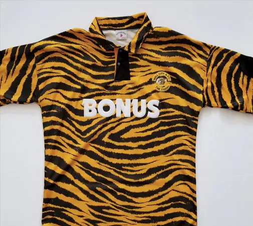
Hull City 1992
We can’t really describe this Hull City shirt other than to recite a very early ode to the Tiger King. This wasn’t even the away shirt that season. Hull may have a tiger as its mascot, but this shirt is totally over the top. It’s as if Fred Flintstone chose the design. Another coloured tiger skin replaced this home shirt the following season.
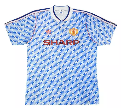
Manchester United 1991
A shirt from Dutch dredges. TDK was the main sponsor of Ajax in 1989 when this shirt was released. A really chaotic shirt where the opponent is immediately taken aback. Should it be a comparison with Mondrian? This shirt is very popular among Ajax supporters.

Inter Milan 2016
This shirt reminds me a lot of the parakeets in Vondelpark in Amsterdam. It may look colourful and you will always look at it, but it’s not right. The colour gradient from neon green to dark blue hurts your eyes. This was certainly not Inter’s best season either. This was the season the club lost its soul and fell into the hands of a Chinese company. Inter finished 7th in Serie A and had its worst group performance in UEFA history. A true classic for the collector!
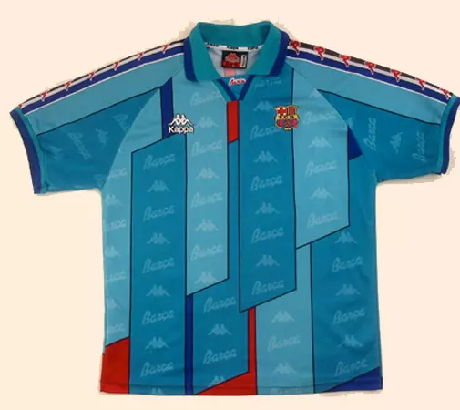
FC Barcelona 1995
The FC Barcelona away shirt had to radiate the allure of the home shirt with red and blue. An epic fail. This shirt with overlapping vertical panels is more reminiscent of a Roman armour worn by a soldier who was about to confront Obelix. The already hideous Kappa logo is also repeated all over the shirt and sleeves. This was Johan Cruyff’s final season as coach. The shirt probably didn’t help. FC Barcelona saw all three prizes of this season slip out of their grasp within the space of ten days.
